day bi day
a title sequence and graphics package for a series called Day Bi Day.
the ask.
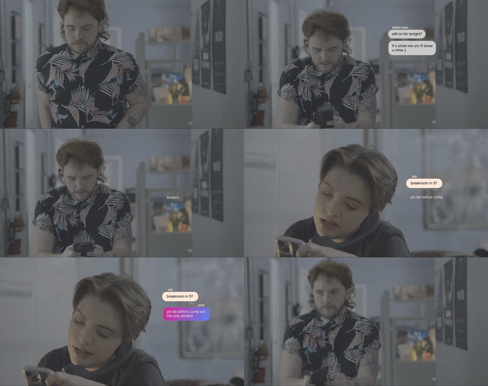
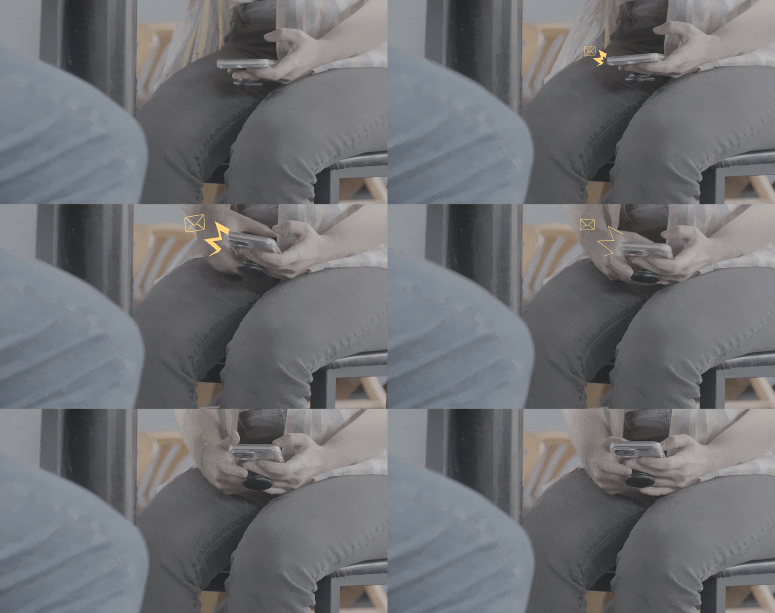
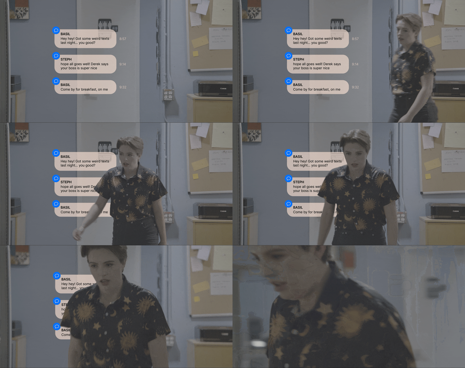
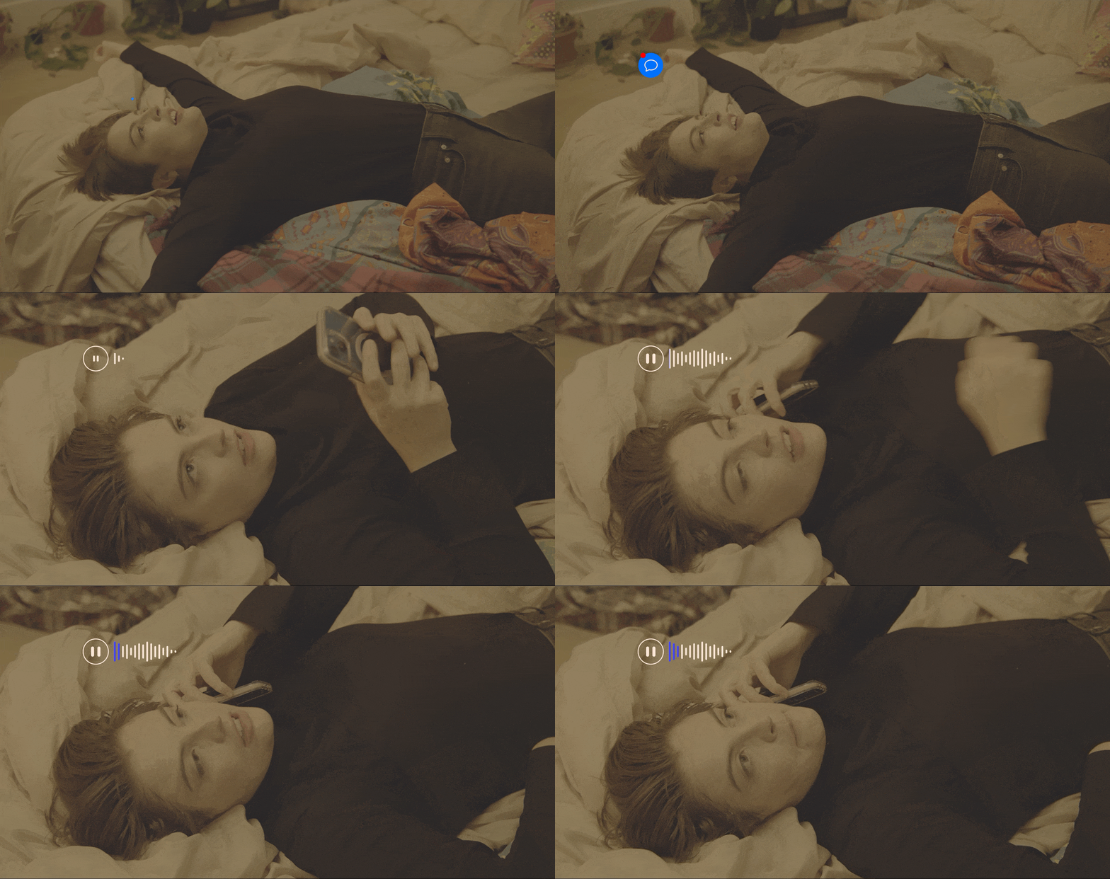
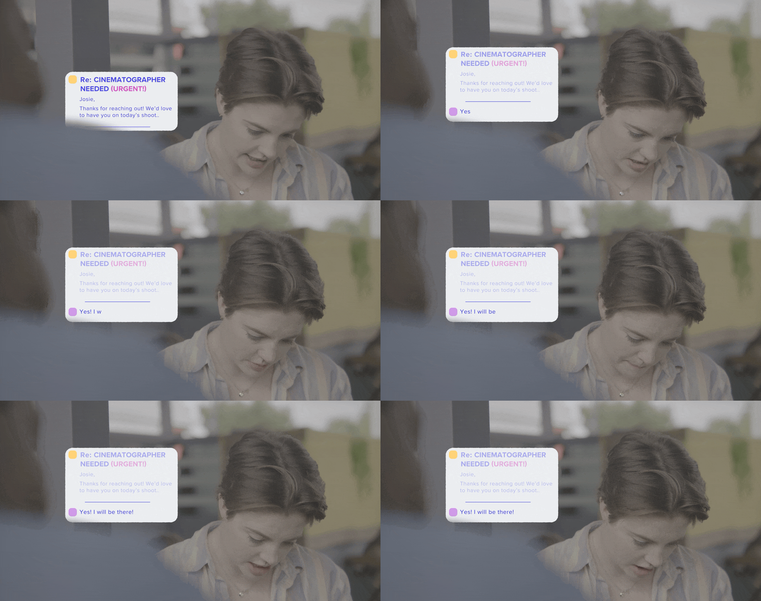
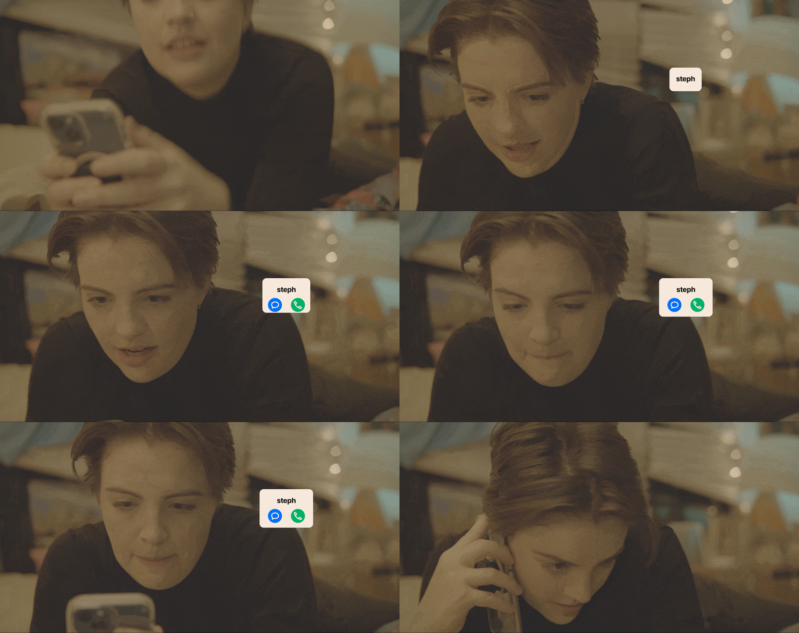
to make a fun, queer, social-media-esque motion design language for a title sequence, end credits, and overlay graphics for the series.
the solution.
using the colors of the bisexual flag as a jumping off point, i grabbed some bright magentas and vibrant blues to carry us through all the characters, swiping through their “profiles” before landing on the title –– big and bold, like the characters.
I used the title sequence as a touchstone for all other graphics. I had the responsibility to find an engaging way to let the audience into these characters’ digital worlds.


